best fonts for self-published books
If you opened up a Word doc and started writing, your book has probably been written in Calibri. Gross. But fret not! We’ve got some much better options headed your way. The best fonts for self-published books most certainly are NOT the default fonts you’re used to working with like Times New Roman or Calibri, but there are still great ebook and self-published font options that you can download for free!
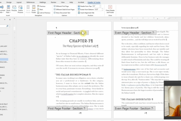
The first thing to understand is the difference between serif and sans-serif fonts. Serifs are those little lines at the end of each letter like you see in Times New Roman, but not in Arial. Any novel or non-fiction book you pick up at the bookstore is going to use a serif font for the main body text.
The next thing you need to understand is that whenever you’re using fonts to publish a book it’s critical to check the licensing. Just because you download a font file for free doesn’t mean you have the rights to use it in print or in your ebook. In fact, most fonts have different license terms for each type of book. Even the fonts that come on Windows PC aren’t necessarily allowed to be used in an ebook. And if you think “Oh, nobody knows who I am, they’ll never find out!” there’s another catch. A lot of “free” fonts you find on the internet are actually stolen, and when you try to embed them in your ebook or PDF for paperback, it won’t work. You’ll get crazy mixed up characters, and you’ll potentially have to re-paginate your entire book! When in in doubt, read the license agreement on the download page, or check the properties of the font.
All of the fonts below either offer paid versions that allow for commercial publication, or free versions that are free for both personal and commercial use.
so what are the best fonts for self-published books?
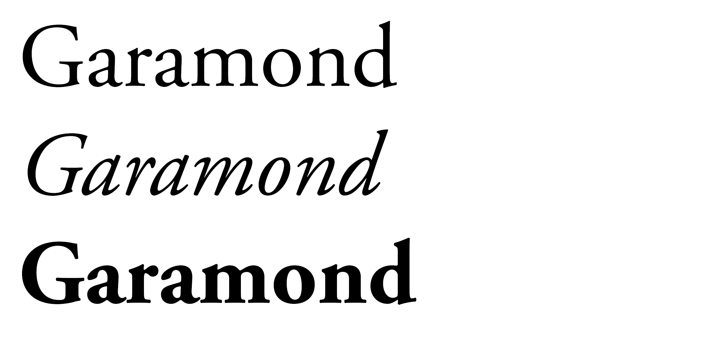
You’ll be hard-pressed to find a post discussing the best fonts for self-publishing without mentioning Garamond. It’s versatile, it’s classic, and it has a very neutral feeling that makes it good for everything from romance novels to nonfiction. While it’s based on the hundreds-year-old version of the font, the latest version is Adobe Garamond Pro, which you can use for free if you’re setting your book in a program like InDesign. If you don’t have an Adobe account, you can pay for a license here:
Even more exciting, Google has a whole font foundry that is absolutely free to use in commercial and personal projects, in print, web, and digital! Huzzah! Their free version, known as EB Garamond, is meant to closely reproduce Claude Garamond’s original design from the mid-16th century.
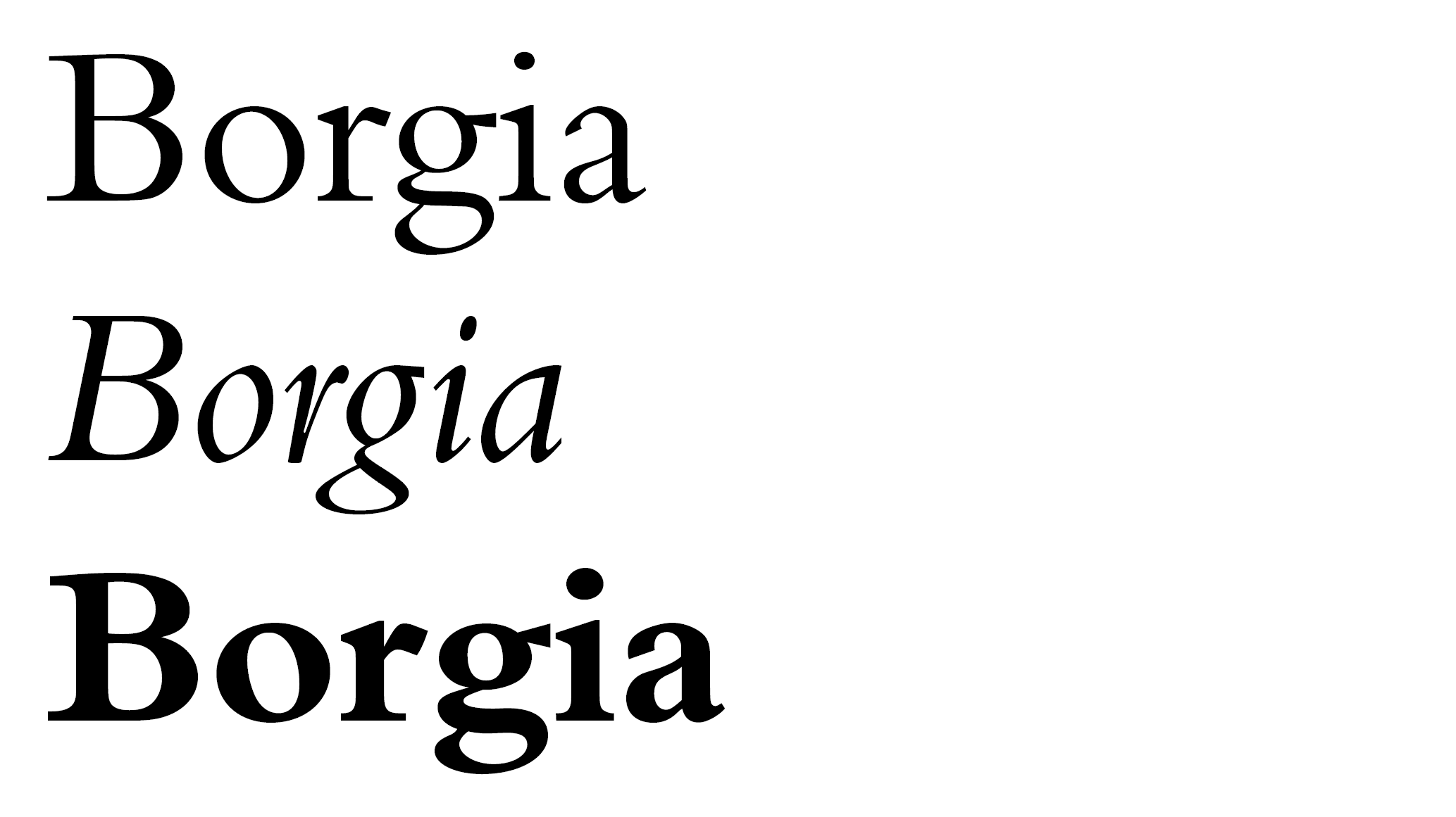 Some people may find Borgia Pro’s slightly rigid angles a little intimidating, but I think they make a great choice, especially for something nonfiction or more academic. While Borgia is free to use in your paperback book, you will have to pay $30 if you want to embed it in your ebook as well. Just remember that with ebook readers, most people won’t see your font. E-readers allow the user to choose their own fonts and sizes so there really isn’t any point in embeddng a body font in your book (though header fonts may be a different story). The font you choose for your paperback book is far more important. And this one is free for print use!
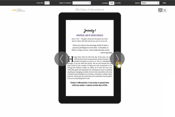
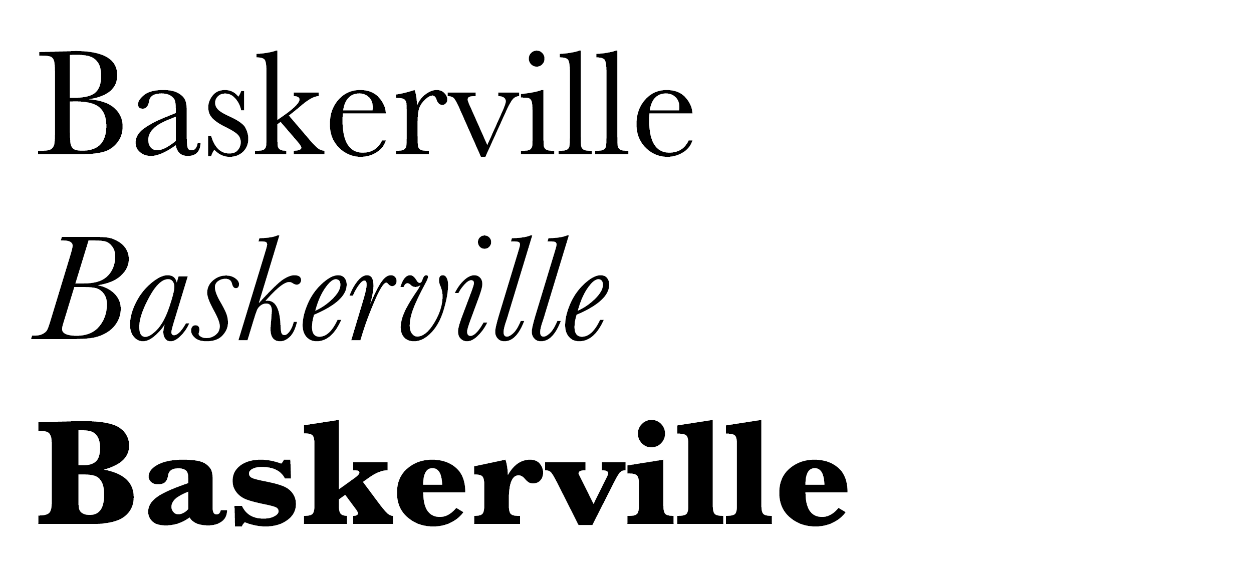 Ahh Baskerville…so clean, so classy. A beautiful body font for anything from a resume to literary fiction. It just never looks bad! (Can you guess what font I usually use for my own books?) While I absolutely love Baskerville, it’s not the cheapest font out there as each family (bold, italic, etc.) requires its own license. But here’s a secret. Baskerville is actually the default font on Amazon Kindle. So if you buy it for the print version of your book, you don’t need to pay for an ebook license as well! There are a million different versions of Baskerville out there so make sure you get the right one!
Download Baskerville from Monotype
Don’t feel like shelling out the cash? Here comes Google to save the day! They have created a lookalike to Baskerville that you can use absolutely free! Though Libre has been slightly altered for on-screen versus in-print reading, it’s still a solid choice if you’re trying to save some money. As with all Google fonts, it’s free for both commercial and personal use in print, web, and digital.
Download Libre Baskerville for free
 Last but certainly not least, Caslon. Caslon is a more understated serif, with just a hint of whimsy to it. It has a feeling of Christopher Robin or maybe even Jane Austen. Caslon is another Adobe Pro font, so you’ll need to purchase it or have an Adobe subscription to access it.
For the free version, you can use Google’s Libre Caslon Text, but note that once again this font face has been optimized for web viewing over print.
Download Libre Caslon Text for free
Whatever feeling you get when you see these fonts, you won’t know for sure until you see them on a full page. Download any or all of them, install them on your computer, and see how they make your book feel. Many fonts have demo downloads that let you see how they look without giving you the full font package. The most important thing a body font in your book can do is go unnoticed. The second you have a font that distracts from your book is the second you’ve lost the reader.
Did I miss anything? What do you think are the best fonts for self-published books?