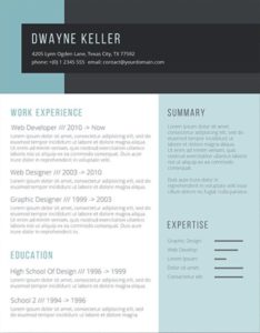
During the last season of international school hiring (my beloved husband just happens to be in the profession), I was helping a friend with her resumé. Lo and behold, this wonderful woman needed no such help. Clean, polished, beautiful fonts, and a bright layout with just a hint of flair. It was almost perfect. However, as the hiring season went on, and she felt she wasn’t getting the response she had expected, she spoke to many (older) professionals who told her that her resume would, without hesitation, be thrown in the trash. Why, do you ask? Because she included a pale blue border along the bottom of the page. You can see the offending horror below.
I myself like to utilize subtle resume borders in most of my designs, though they can cause problems when printing, and trust me—people still print out resumes on actual pieces of paper.
My thoughts on the matter are thus: use a tasteful border with a small pop of color if you please. Ignore the luddites; they are a dying breed. If someone rejects your resume because you have included a modern and tasteful flair in a world of digital reading, you don’t want to work for that person anyway. BUT, and this is a big but, do not, under any circumstances, border your resume with a heavy, thick, patterened, lord knows whatever this is:
The end.