So what are the best resume fonts?
If you do a google search on the best fonts for resumes, you’ll find that most people suggest keeping it simple: use Times New Roman or Calibri. An article in Business Insider even suggests using Arial??? And sure, you can do that—if you want your resume to look like you made it in 2010. Most of these suggestions are to keep your resume readable across multiple devices and screen resolutions. As we all know, fonts will render differently on different screens and different operating systems. However, if you are following the cardinal rule of resumes, this won’t be a problem.
You definitely do need to be careful not to use crazy, hard-to-read fonts, or too many different fonts, but there is still a way to blend fonts—both serif and sans sarif—to help highlight sections on your resume and make it stand out among the pack, without looking ridiculous. Of course, if you want to play it safe, you can always pick one font for your entire resume, and simply play around with size and emphasis (bold and italics) to help your sections stand out.
The best serif font for resumes? Hands down:

Baskerville. You can download the full font set for free here.
Baskerville is classy, smooth, beautiful, and narrow so it helps you squeeze in more content without looking messy. Its italic is super classy, and it has a great ampersand, which can add an unquantifiable flair. While I’m not a big fan of Baskerville for headings, you certainly can do your entire resume using only this family!

Borgia Pro is another great serif option that is slightly larger than Baskerville, but gives a much more professional touch than plain old TNR or Garamond, especially in italics. You can download the full font set here.


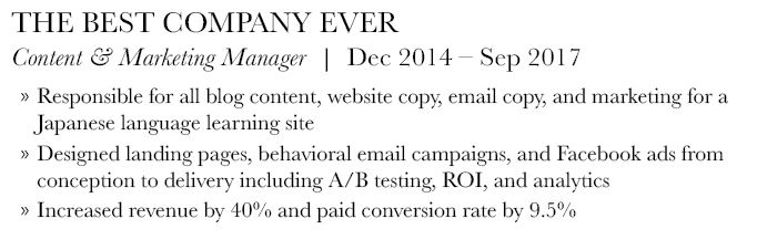
Bodoni FLF is a great choice for serif headers in a resume. While I think for most jobs now it’s best to do sans serif headers, a serif header can lend a more traditional or academic touch. Play around with regular vs. bold to help your headings really stand out! Note that due to the weight and density of Bodoni Regular, it is not recommended as a body font for your resume. You can see in the example below why it doesn’t really work. But man does the header stand out! Also, great ampersand!

”use a sans serif header and serif body font for the biggest impact
Best sans serif resume fonts?
There are a few sans serif fonts that are simple, clean, and work great as accents to your serif body fonts. Here are my personal favorites:

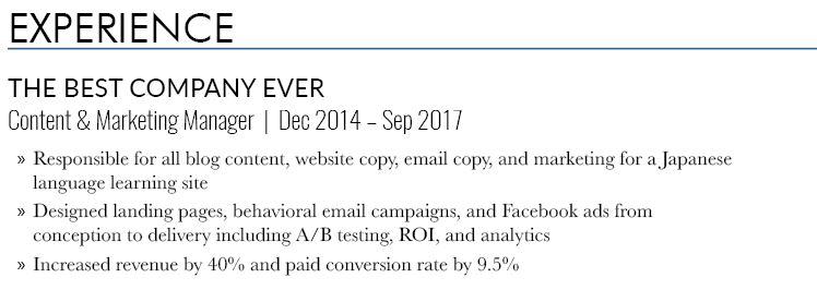
Futura. Specifically Futura BK BT and Fututa MD BT. This font is clean and sharp for great headings. Think of it as your H1. Futura has enough style options to do your entire resume in it (without just relying on bold and italics) if you’re looking for an all-sans-serif option as well. Notice how I used a condensed version, (Futura MdCn BT) for the job title and dates in the example version.
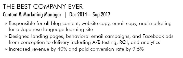

Oswald. Oswald is a more condensed font that I like to use for job titles and other sub-headings, particularly Oswald Light. Bonus points as Oswald is a Google Font! Think of this as your H3. Oswald can also work as a body font in a sans-serif resume, and its condensed nature means you can really squeeze more in!


Lato. Lato is a wider font that I think works well for company names. It is not an all-caps font, however I usually use it as such for additional emphasis. Bonus points as Lato is also a Google Font! Think of it as your H2. You can also use Lato as sans serif option for your body font as well, however I tend to think it comes off as a little juvenile. Just please, whatever you do, don’t use Arial!

So how does it look when we blend them altogether?